
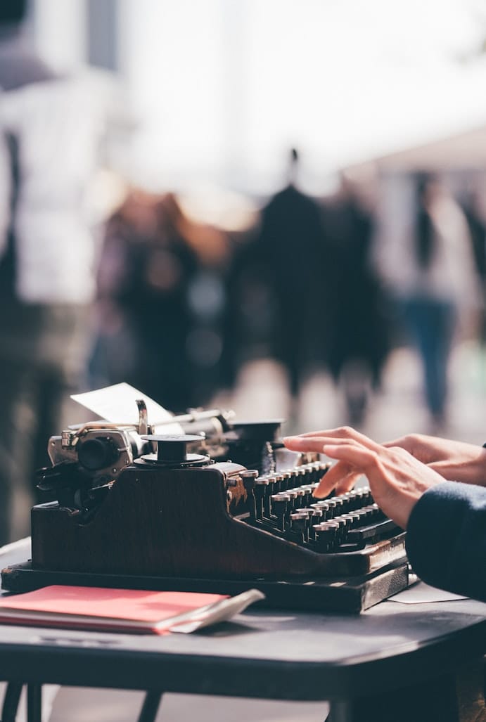
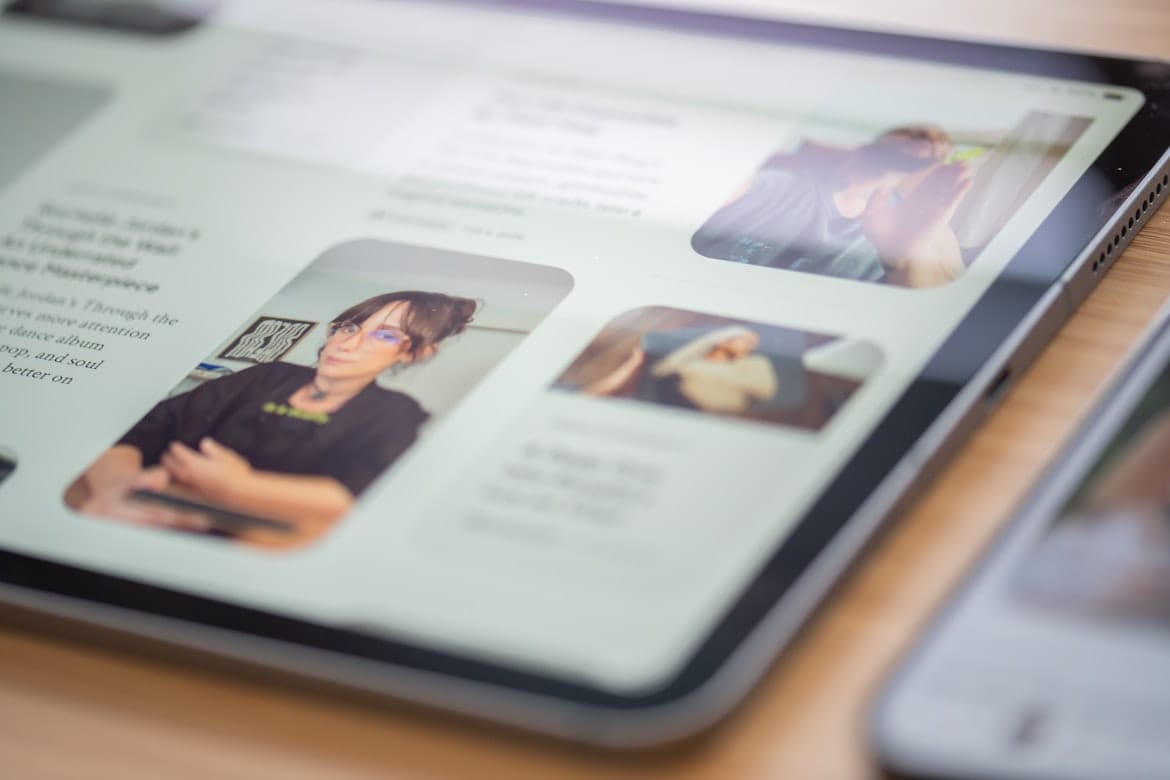
Reading online is fundamentally different from reading a printed magazine or book. Screens vary in size, environments change, and readers often arrive with a specific question, headline, or story in mind.
Good editorial design recognizes these differences.
A successful publishing website doesn't simply place an article inside a template. It creates an environment that helps readers discover content, understand its structure, and stay focused on the story.
At Themeanax, we believe the reading experience should be one of the most important considerations when designing a publishing theme.
Typography Sets the Tone
Typography is one of the first things readers notice, even when they don't consciously recognize it.
The choice of typeface, font size, line height, spacing, and hierarchy determines how comfortable an article feels. A headline needs enough presence to establish importance, while body text should remain comfortable across long reading sessions.
Good typography also creates structure.
Readers should be able to distinguish headlines, subheadings, captions, metadata, quotations, and supporting information without having to think about where one section ends and another begins.
The result should feel natural rather than designed for design's sake.
Make Content Easy to Scan
Online readers rarely begin by reading every word from top to bottom. They scan headlines, images, subheadings, excerpts, and highlighted information before deciding where to focus.
Editorial layouts should support this behavior.
Clear hierarchy allows readers to quickly understand what an article contains while still providing a comfortable path into long-form reading.
Well-structured content benefits both readers who want to explore deeply and those who are simply looking for something specific.
Mobile Reading Matters
A publication can have an excellent desktop design and still provide a poor experience on mobile.
Readers increasingly discover stories through phones, social platforms, newsletters, and search results. A responsive theme therefore needs to treat mobile as a primary reading environment rather than a smaller version of the desktop layout.
Images should remain clear, navigation should remain accessible, and text should retain comfortable proportions regardless of screen size.
The best responsive designs don't simply shrink—they adapt.
Accessibility Is Good Design
Accessibility benefits everyone.
Readable contrast, logical heading structures, keyboard-friendly interactions, meaningful labels, and appropriately sized text make websites easier to use for people with different abilities and browsing preferences.
These decisions also improve the overall experience for everyday readers.
A publication should never require readers to struggle with its interface before they can reach the content.
Images Should Support the Story
Editorial imagery has an important role, but more images don't necessarily create a better experience.
A strong image can establish mood, provide context, or encourage readers to explore an article. Poorly placed imagery can interrupt the reading flow.
This is why image proportions, cropping, spacing, and placement should be considered alongside the content itself.
The best editorial layouts allow photography and typography to work together.
Remove Unnecessary Friction
Every additional interaction creates a small amount of friction.
Readers shouldn't have to search for navigation, fight with intrusive elements, or work through complicated interfaces simply to read an article.
Good design often means knowing what not to add.
Clear navigation, predictable interactions, sensible spacing, and focused content presentation can make a publication feel significantly easier to use.
Final Thoughts
Designing for digital readers isn't about following a single formula. It's about understanding how people discover, scan, read, and interact with content across different environments.
Typography creates comfort. Hierarchy creates clarity. Responsive design creates accessibility. Thoughtful interactions create confidence.
When these elements work together, the interface becomes almost invisible—and that's often the sign of successful editorial design.
At Themeanax, we believe the best Ghost themes should do exactly that: get out of the way and let great stories take center stage.

Member Discussion